3.1 Introduction
Cyclic temporal granularities (Bettini et al. 1998; Gupta et al. 2021) are temporal deconstructions that define cyclic repetitions in time, e.g. hour-of-day, day-of-month, or regularly scheduled public holidays. These granularities form ordered or unordered categorical variables. An example of an ordered granularity is day-of-week, where Tuesday is always followed by Wednesday, and so on. An unordered granularity example is . We can use granularities to explore patterns in univariate time series by examining the distribution of the measured variable across different categories of the cyclic granularities.
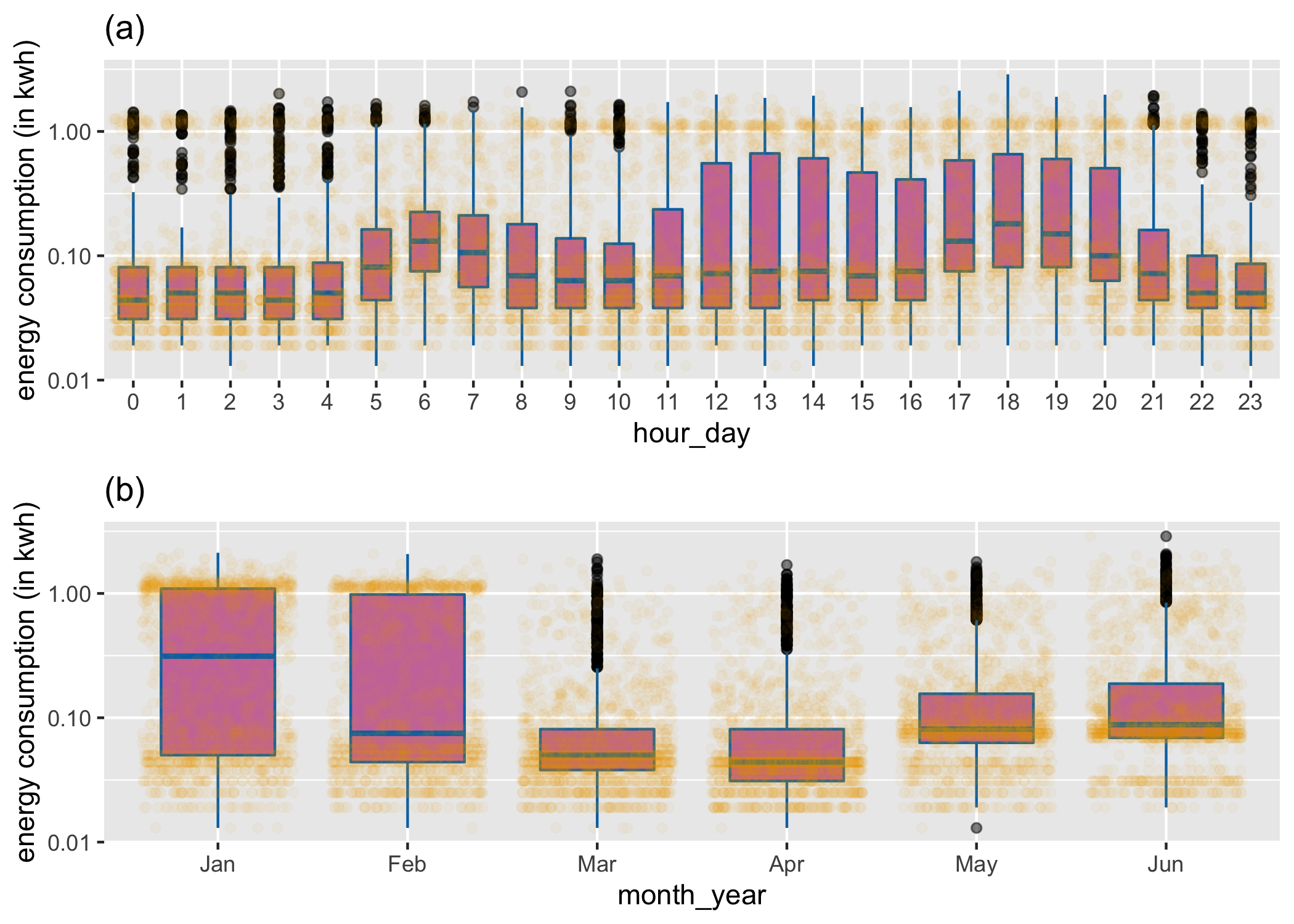
Figure 3.1: A cyclic granularity can be considered to be a categorical variable, and used to break the data into subsets. Here, side-by-side boxplots overlaid on jittered dotplots explore the distribution of of energy use by a household for two different cyclic granularities: (a) hour-of-day and (b) and month-of-year. Daily peaks occur in morning and evening hours, indicating a working household, where members leave for and return from work. More volatility of usage in summer months (Jan, Feb) is probably due to air conditioner use on just some days.
As a motivating example, consider Figure which shows electricity smart meter data plotted against two granularities (hour-of-day, month-of-year). The data was collected on a single household in Melbourne, Australia, over a six month period, and was previously used in Wang, Cook, and Hyndman (2020b). The categorical variable (granularity) is mapped to the x-axis, and the distribution of the response variable is displayed using both side-by-side jittered dotplots and boxplots. From panel (a) it can be seen that energy consumption is higher during the morning hours (5–8), when members in the household wake up, and again in the evening hours (17–20), possibly when members get back from work. In addition, the largest variation in energy use is in the afternoon hours (12–16), as seen in the length of the boxes. From panel (b), it is seen that the variability in energy usage is higher in Jan and Feb, probably due to the usage of air conditioners on some days. The median usage is highest in January, dips in February–April and rises again in May–June, although not to the height of January usage. This suggests that the household does not use as much electricity for heating as it does for air conditioning. A lot of households in Victoria use gas heating and hence the heater use might not be reflected in the electricity data.
Many different displays could be constructed using different granularities including day-of-week, day-of-month, weekday/weekend, etc. However, only a few might be interesting and reveal important patterns in energy usage. Determining which displays have “significant” distributional differences between categories of the cyclic granularity, and plotting only these, would make for efficient exploration.
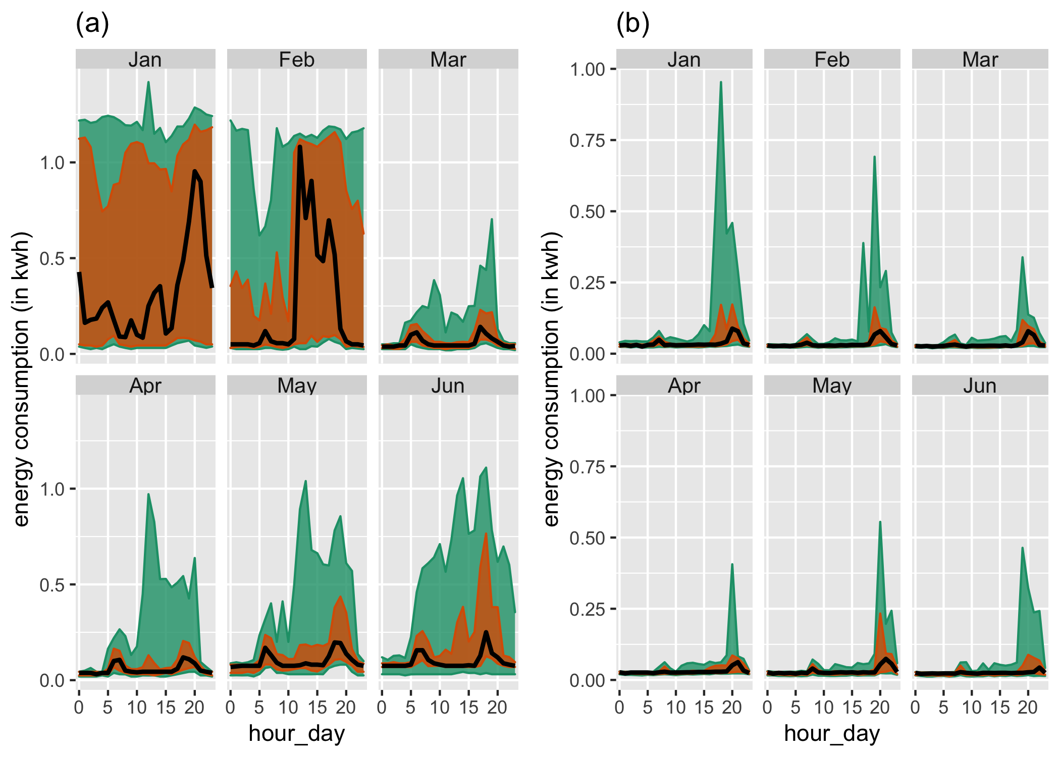
Figure 3.2: Distribution of energy consumption displayed through area quantile plots across two cyclic granularities month-of-year and hour-of-day and two households. The black line is the median, whereas the orange band covers the 25th to 75th percentile and the green band covers the 10th to 90th percentile. Difference between the 90th and 75th quantiles is less for (Jan, Feb) for the first household (a), suggesting that it is a more frequent user of air conditioners than the second household (b). Energy consumption for (a) changes across both granularities, whereas for (b) daily pattern stays same irrespective of the months.
Exploring the distribution of the measured variable across two cyclic granularities provides more detailed information on its structure. For example, Figure (a) shows the usage distribution across hour-of-day conditional on month-of-year across two households. It shows the hourly usage over a day does not remain the same across months. Unlike other months, the 75th and 90th percentile for all hours of the day in January are high, similar, and are not characterized by a morning and evening peak. The household in Figure (b) has 90th percentile consumption higher in summer months relative to autumn or winter, but the 75th and 90th percentile are far apart in all months, implying that the second household resorts to air conditioning much less regularly than the first one. The differences seem to be more prominent across month-of-year (facets) than hour-of-day (x-axis) for this household, whereas they are prominent for both cyclic granularities for the first household.
Are all four displays in Figures and useful in understanding the distributional difference in energy usage? Which ones are more useful than others? If \(N_C\) is the total number of cyclic granularities of interest, the number of displays that could be potentially informative is \(N_C\) when considering displays of the form in Figure . The dimension of the problem, however, increases when considering more than one cyclic granularity. When considering displays of the form in Figure , there are \(N_C(N_C-1)\) possible pairwise plots exhaustively, with one of the two cyclic granularities acting as the conditioning variable. This can be overwhelming for human consumption even for moderately large \(N_C\). It is therefore useful to identify those displays that are informative across at least one cyclic granularity.
This problem is similar to Scagnostics (Scatterplot Diagnostics) by Tukey and Tukey (1988), which are used to identify meaningful patterns in large collections of scatterplots. Given a set of \(v\) variables, there are \(v(v-1)/2\) pairs of variables, and thus the same number of possible pairwise scatterplots. Therefore, even for small \(v\), the number of scatterplots can be large, and scatterplot matrices (SPLOMs) can easily run out of pixels when presenting high-dimensional data. Dang and Wilkinson (2014); Wilkinson, Anand, and Grossman (2005) provide potential solutions to this, where a few characterizations can be used to locate anomalies in density, shape, trend, and other features in the 2D point scatters.
In this paper, we provide a solution to narrowing down the search from \(N_C(N_C-1)\) conditional distribution plots by introducing a new distance measure that can be used to detect significant distributional differences across cyclic granularities. This work is a natural extension of our previous work (Gupta et al. 2021) which narrows down the search from \(N_C(N_C-1)\) plots by identifying pairs of granularities that can be meaningfully examined together (a “harmony”), or when they cannot (a “clash”). However, even after excluding clashes, the list of harmonies left may be too large for exhaustive exploration. Hence, there is a need to reduce the search even further by including only those harmonies that contain useful information.
Buja et al. (2009); Majumder, Hofmann, and Cook (2013) present methods for statistical significance testing of visual findings using human cognition as the statistical tests. In this paper, the visual discovery of distributional differences is facilitated by choosing a threshold for the proposed numerical distance measure, eventually selecting only those cyclic granularities for which the distributional differences are sufficient to make it an interesting display.
The article is organized as follows. Section introduces a distance measure for detecting distributional difference in temporal granularities, which enables identification of patterns in the time series data; Section devises a selection criterion by choosing a threshold, which results in detection of only significantly interesting patterns. Section provides a simulation study on the proposed methodology. Section presents an application to residential smart meter data in Melbourne to show how the proposed methodology can be used to automatically detect temporal granularities along which distributional differences are significant.