2.5 Visualization
The purpose is to visualize the distribution of the continuous variable (\(v\)) conditional on the values of two granularities, \(C_i\) and \(C_j\). Since \(C_i\) and \(C_j\) are factors or categorical variables, data subsets corresponding to each combination of their levels form a subgroup and the visualization amounts to having displays of distributions for different subgroups. The response variable \((v)\) is plotted on the y-axis and the levels of \(C_i (C_j)\) on the x-axis, conditional on the levels of \(C_j (C_i)\). This means, carrying out the same plot corresponding to each level of the conditioning variable. This is consistent with the widely used grammar of graphics which is a framework to construct statistical graphics by relating the data space to the graphic space (Wilkinson 1999; Wickham 2016).
2.5.1 Data summarization
There are several ways to summarize the distribution of a data set such as estimating the empirical distribution or density of the data, or computing a few quantiles or other statistics. This estimation or summarization could be potentially misleading if it is performed on rarely occurring categories (Section ). Even when there are no rarely occurring events, the number of observations may vary greatly within or across each facet, due to missing observations or uneven locations of events in the time domain. In such cases, data summarization should be used with caution as sample sizes will directly affect the accuracy of the estimated quantities being displayed.
2.5.2 Display choices for univariate distributions
The basic plot choice for our data structure is one that can display distributions. For displaying the distribution of a continuous univariate variable, many options are available. Displays based on descriptive statistics include boxplots (Tukey 1977) and its variants such as notched boxplots (McGill, Tukey, and Larsen 1978) or other variations as mentioned in Wickham and Stryjewski (2012). They also include line or area quantile plots which can display any quantiles and not only quartiles like in a boxplot. Plots based on kernel density estimates include violin plots (Hintze and Nelson 1998), summary plots (Potter et al. 2010), ridge line plots (Wilke 2020), and highest density region (HDR) plots (Hyndman 1996). The less commonly used letter-value plots (Hofmann, Wickham, and Kafadar 2017) is midway between boxplots and density plots. Letter values are order statistics with specific depths; for example, the median (\(M\)) is a letter value that divides the data set into halves. Each of the next letter values splits the remaining parts into two separate regions so that the fourths (\(F\)), eighths (\(E\)), sixteenths (\(D\)), etc. are obtained. They are useful for displaying the distributions beyond the quartiles especially for large data,
where boxplots mislabel data points as outliers.
One of the best approaches in exploratory data analysis is to draw a variety of plots to reveal information while keeping in mind the drawbacks and benefits of each of the plot choices. For example, boxplots obscure multimodality, and interpretation of density estimates and histograms may change depending on the bandwidth and binwidths respectively. In R package gravitas (Gupta et al. 2020), boxplots, violin, ridge, letter-value, line and area quantile plots are implemented, but it is potentially possible to use any plots which can display the distribution of the data.
2.5.3 Comparison across sub-groups induced by conditioning
Levels
The levels of cyclic granularities affect plotting choices since space and resolution may be problematic with too many levels. A potential approach could be to categorize the number of levels as low/medium/high/very high for each cyclic granularity and define some criteria based on human cognitive power, available display size and the aesthetic mappings. Default values for these categorizations could be chosen based on levels of common temporal granularities like days of the month, days of the fortnight, or days of the week.
Synergy of cyclic granularities
The synergy of the two cyclic granularities will affect plotting choices for exploratory analysis. Cyclic granularities that form clashes (Section 2.4.1) or near-clashes lead to potentially ineffective graphs. Harmonies tend to be more useful for exploring patterns. a shows the distribution of half-hourly electricity consumption through letter value plots across months of the year conditional on quarters of the year. This plot does not work because quarter-of-year clashes with month-of-year, leading to empty subsets. For example, the first quarter never corresponds to December.
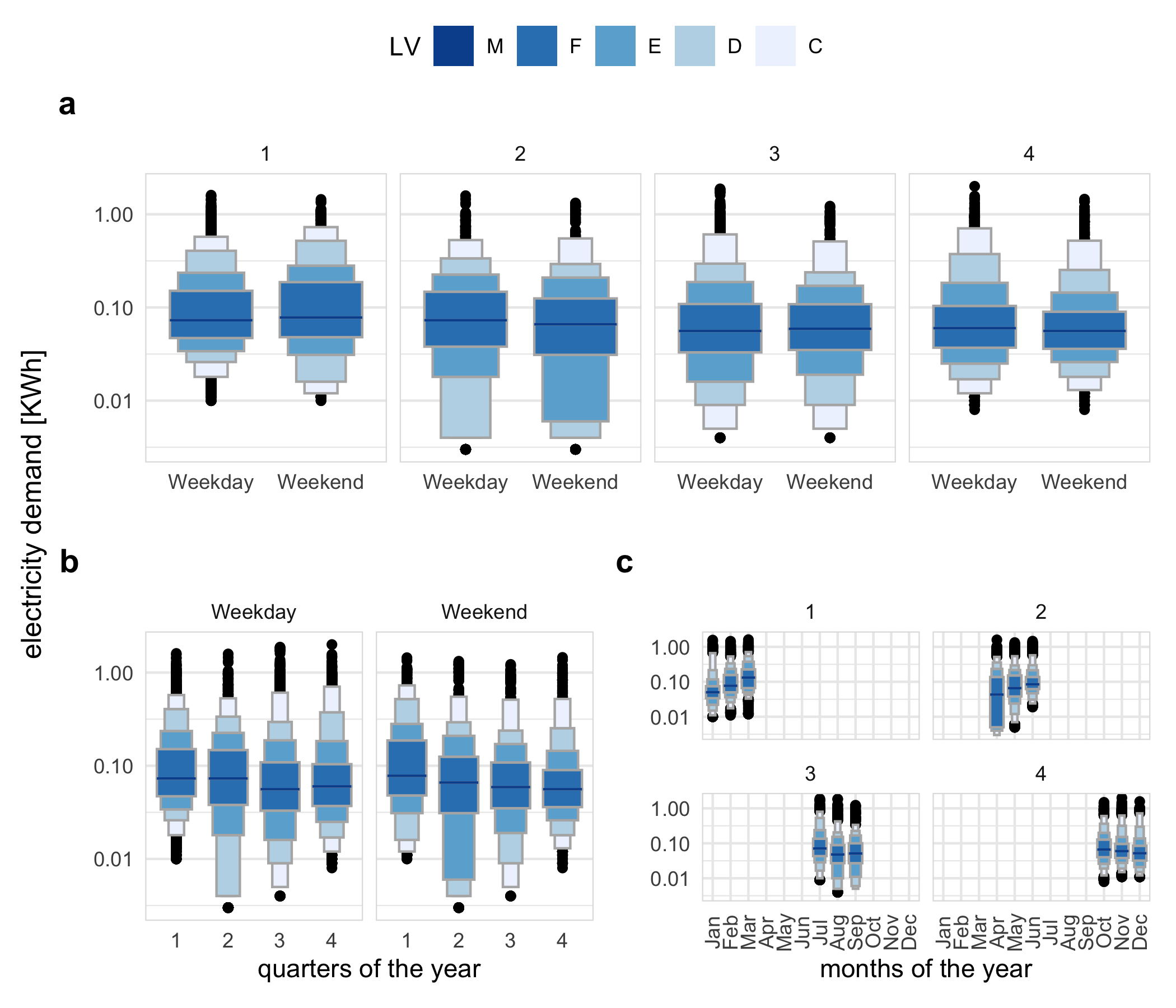
Figure 2.4: Distribution of energy consumption displayed as letter value plots, illustrating harmonies and clashes, and how mappings change emphasis: a weekday/weekend faceted by quarter-of-year produces a harmony, b quarter-of-year faceted by weekday/weekend produces a harmony, c month-of-year faceted by quarter-of-year produces a clash, as indicated by the empty sets and white space. Placement within a facet should be done for primary comparisons. For example, arrangement in a makes it easier to compare across weekday type (x-axis) within a quarter (facet). It can be seen that in quarter 2, more mass occupied the lower tail on the weekends (letter value E corresponding to tail area 1/8) relative to that of the weekdays (letter value D 1/16), which corresponds to more days with lower energy use in this period.
Conditioning variable
When \(C_i\) is mapped to the \(x\) position and \(C_j\) to facets, then the \(A_k\) levels are juxtaposed and each \(B_\ell\) represents a group/facet. Gestalt theory suggests that when items are placed in close proximity, people assume that they are in the same group because they are close to one another and apart from other groups. Hence, in this case, the \(A_k\)’s are compared against each other within each group. With the mapping of \(C_i\) and \(C_j\) reversed, the emphasis will shift to comparing \(B_\ell\) levels rather than \(A_k\) levels. For example, b shows the letter value plot across weekday/weekend partitioned by quarters of the year and c shows the same two cyclic granularities with their mapping reversed. b helps us to compare weekday and weekend within each quarter and c helps to compare quarters within weekend and weekday.