2.6 Applications
2.6.1 Smart meter data of Australia
Smart meters provide large quantities of measurements on energy usage for households across Australia. One of the customer trials (Department of the Environment and Energy 2018) conducted as part of the Smart Grid Smart City project in Newcastle and parts of Sydney provides customer level data on energy consumption for every half hour from February 2012 to March 2014. We can use this data set to visualize the distribution of energy consumption across different cyclic granularities in a systematic way to identify different behavioral patterns.
Cyclic granularities search and computation
The tsibble object smart_meter10 from R package gravitas (Gupta et al. 2020) includes the variables reading_datetime, customer_id and general_supply_kwh denoting the index, key and measured variable respectively. The interval of this tsibble is 30 minutes.
To identify the available cyclic time granularities, consider the conventional time deconstructions for a Gregorian calendar that can be formed from the 30-minute time index: half-hour, hour, day, week, month, quarter, half-year, year. In this example, we will consider the granularities hour, day, week and month giving six cyclic granularities “hour_day,” “hour_week,” “hour_month,” “day_week,” “day_month” and “week_month,” read as “hour of the day,” etc. To these, we add day-type (“wknd_wday”) to capture weekend and weekday behavior. Now that we have a list of cyclic granularities to look at, we can compute them using the results in Section .
Screening and visualizing harmonies
Using these seven cyclic granularities, we want to explore patterns of energy behavior. Each of these seven cyclic granularities can either be mapped to the x-axis or to facets. Choosing \(2\) of the possible \(7\) granularities, gives \(^{7}P_2 = 42\) candidates for visualization. Harmonies can be identified among those \(42\) possibilities to narrow the search. shows \(16\) harmony pairs after removing clashes and any cyclic granularities with more than \(31\) levels, as effective exploration becomes difficult with many levels (Section ).
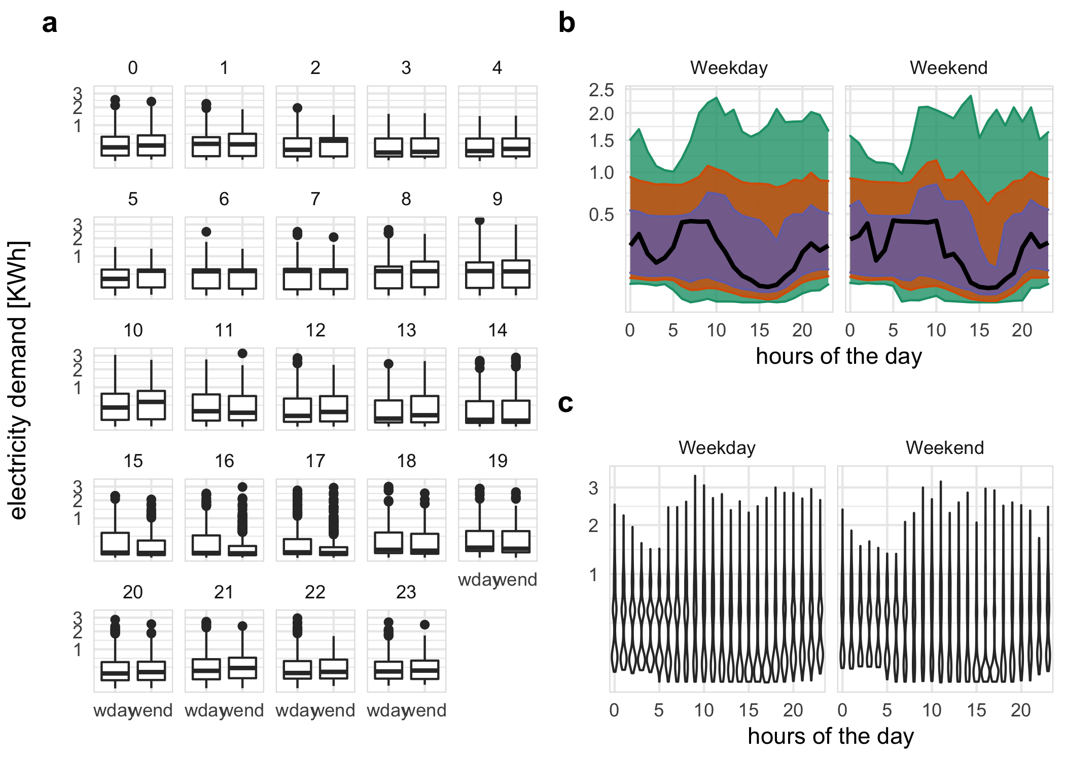
Figure 2.5: Energy consumption of a single customer shown with different distribution displays, and granularity arrangements: hour of the day; and weekday/weekend. a The side-by-side boxplots make the comparison between day types easier, and suggest that there is generally lower energy use on the weekend. Interestingly, this is the opposite to what might be expected. Plots b, c examine the temporal trend of consumption over the course of a day, separately for the type of day. The area quantile emphasizes time, and indicates that median consumption shows prolonged high usage in the morning on weekdays. The violin plot emphasizes subtler distributional differences across hours: morning use is bimodal.
A few harmony pairs are displayed in to illustrate the impact of different distribution plots and reverse mapping. For each of b and c, \(C_i\) denotes day-type (weekday/weekend) and \(C_j\) is hour-of-day. The geometry used for displaying the distribution is chosen as area-quantiles and violins in b and c respectively. a shows the reverse mapping of \(C_i\) and \(C_j\) with \(C_i\) denoting hour-of-day and \(C_j\) denoting day-type with distribution geometrically displayed as boxplots.
In b, the black line is the median, whereas the purple (narrow) band covers the 25th to 75th percentile, the orange (middle) band covers the 10th to 90th percentile, and the green (broad) band covers the 1st to 99th percentile. The first facet represents the weekday behavior while the second facet displays the weekend behavior; energy consumption across each hour of the day is shown inside each facet. The energy consumption is extremely skewed with the 1st, 10th and 25th percentile lying relatively close whereas 75th, 90th and 99th lying further away from each other. This is common across both weekdays and weekends. For the first few hours on weekdays, median energy consumption starts and continues to be higher for longer compared to weekends.
The same data is shown using violin plots instead of quantile plots in c. There is bimodality in the early hours of the day for weekdays and weekends. If we visualize the same data with reverse mapping of the cyclic granularities (a), then the natural tendency would be to compare weekend and weekday behavior within each hour and not across hours. Then it can be seen that median energy consumption for the early morning hours is higher for weekdays than weekends. Also, outliers are more prominent in the later hours of the day. All of these indicate that looking at different distribution geometry or changing the mapping can shed light on different aspects of energy behavior for the same sample.
2.6.2 T20 cricket data of Indian Premier League
Our proposed approach can be generalized to other hierarchical granularities where there is an underlying ordered index. We illustrate this with data from the sport cricket. Cricket is played with two teams of 11 players each, with each team taking turns batting and fielding. This is similar to baseball, wherein the batsman and bowler in cricket are analogous to a batter and pitcher in baseball. A wicket is a structure with three sticks, stuck into the ground at the end of the cricket pitch behind the batsman. One player from the fielding team acts as the bowler, while another takes up the role of the wicket-keeper (similar to a catcher in baseball). The bowler tries to hit the wicket with a ball, and the batsman defends the wicket using a bat. At any one time, two of the batting team and all of the fielding team are on the field. The batting team aims to score as many runs as possible, while the fielding team aims to successively dismiss 10 players from the batting team. The team with the highest number of runs wins the match.
Cricket is played in various formats and Twenty20 cricket (T20) is a shortened format, where the two teams have a single innings each, which is restricted to a maximum of 20 overs. An over will consist of 6 balls (with some exceptions). A single match will consist of 2 innings and a season consists of several matches. Although there is no conventional time component in cricket, each ball can be thought to represent an ordering over the course of the game. Then, we can conceive a hierarchy where the ball is nested within overs, overs nested within innings, innings within matches, and matches within seasons. Cyclic granularities can be constructed using this hierarchy. Example granularities include ball of the over, over of the innings, and ball of the innings. The hierarchy table is given in . Although most of these cyclic granularities are circular by the design of the hierarchy, in practice some granularities are aperiodic. For example, most overs will consist of 6 balls, but there are exceptions due to wide balls, no-balls, or when an innings finishes before the over finishes. Thus, the cyclic granularity ball-of-over may be aperiodic.
The Indian Premier League (IPL) is a professional T20 cricket league in India contested by eight teams representing eight different cities in India. The IPL ball-by-ball data is provided in the cricket data set in the gravitas package for a sample of 214 matches spanning 9 seasons (2008 to 2016).
Many interesting questions could be addressed with the cricket data set. For example, does the distribution of total runs depend on whether a team bats in the first or second innings? The Mumbai Indians (MI) and Chennai Super Kings (CSK) appeared in the final playoffs from 2010 to 2015. Using data from these two teams, it can be observed (a) that for the team batting in the first innings there is an upward trend of runs per over, while there is no clear upward trend in the median and quartile deviation of runs for the team batting in the second innings after the first few overs. This suggests that players feel mounting pressure to score more runs as they approach the end of the first innings, while teams batting second have a set target in mind and are not subjected to such mounting pressure and therefore may adopt a more conservative run-scoring strategy.
Another question that can be addressed is if good fielding or bowling (defending) in the previous over affects the scoring rate in the subsequent over. To measure the defending quality, we use an indicator function on dismissals (1 if there was at least one wicket in the previous over, 0 otherwise). The scoring rate is measured by runs per over. b shows that no dismissals in the previous over leads to a higher median and quartile spread of runs per over compared to the case when there has been at least one dismissal in the previous over. This seems to be unaffected by the over of the innings (the faceting variable). This might be because the new batsman needs to “play himself in” or the dismissals lead the (not-dismissed) batsman to adopt a more defensive play style. Run rates will also vary depending on which player is facing the next over and when the wicket falls in the previous over.
Here, wickets per over is an aperiodic cyclic granularity, so it does not appear in the hierarchy table. These are similar to holidays or special events in temporal data.
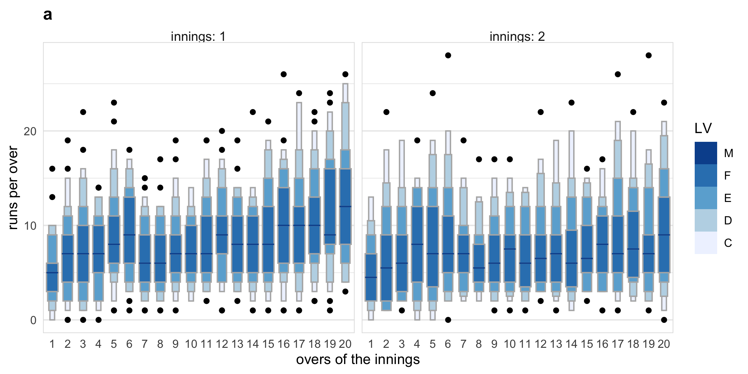
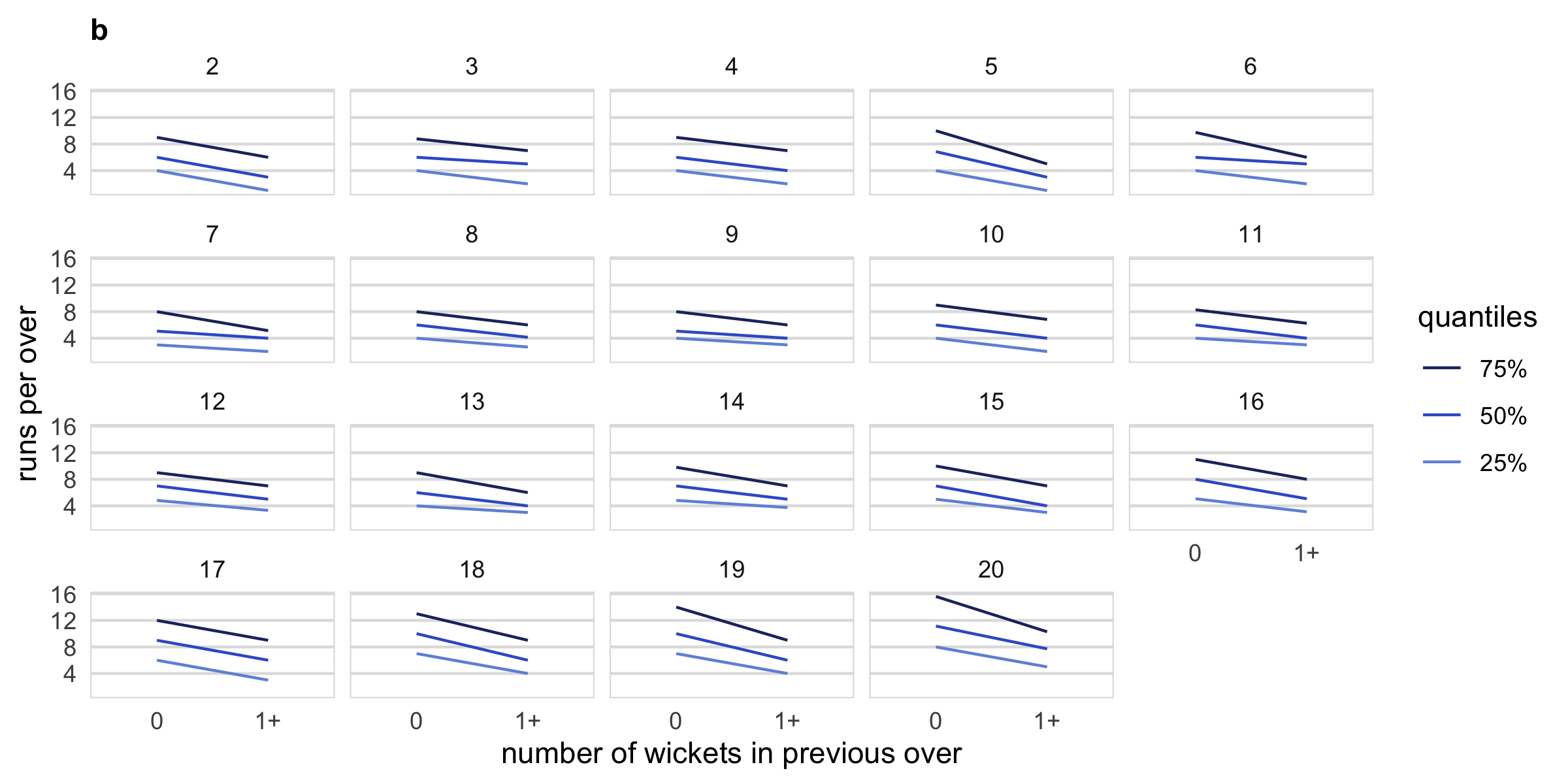
Figure 2.6: Examining distribution of runs per innings, overs of the innings and number of wickets in previous innings. Plot a displays distribution using letter value plots. A gradual upward trend in runs per over can be seen in innings 1, which is not present in innings 2. Plot b shows quantile plots of runs per over across an indicator of wickets in the previous over, faceted by current over. When a wicket occurred in the previous over, the runs per over tends to be lower throughout the innings.